Zac Lux
TV Did it First
March 2nd, 2010
Wednesday, April 14, 2010
Wednesday, April 7, 2010
April 7
Important topics of the lecture:
- Basel school of design
- Emil Ruder
- Armin Hoffman
- Josef Muller Brockman
- The Swiss Grid
- The Golden Age of Logos
- "Good Design is Good Business"
- Saul Bass
- Paul Rand
- Use of wit value in advertisements
- Simplicity enables the viewer to interpret the context immediately
- Bradbury Thompson
- Chermayeff and Geismar Associates
- Unigrid system
- Knoll-Vignelli Associates
- Corporate Design
- Media Revolution
- Henry Wolf
- George Lois
- The New Advertising
- Photo-typography
- Herb Lubalin
- "Figurative Typography"
Wednesday, March 31, 2010
March 31st
Important topics of the lecture:
- The Isotype Movement
- Otto Neurath
- Origins of pictographic models
- Lexicons
- Notion of engineering
- Ladislav Sutnar
- Design for information
- Herbert Bayer
- Modernism and the NY school
- Flight from Hitler and Facism created the greatest transitional migration of intellectual and creative talent in history.
- Modernism
- American design was pragmatic, intuitive and informal
- Laster Beal
- Paul Rand
- Alexey Brodovitch
- Age of Information
- International style
- School at ULM
- Theo Ballmer
- Max Bill
- Anton Stankowski
- Early Swiss Design
- Helvetica
Wednesday, March 3, 2010
Lecture, March 3, 2010
Important topics of the lecture:
- Dutch masters of New Typography
- Dutch Modernism
- Paul Shoetma
- Tschichold
- Printing arts perform as an expressive tool.
- Hendrick N. Werkman.
- El Lissitzky
- Piet Zwart
- Style more than substance
- Visually arresting layouts.
- Designers applied reductive compositional principles of Plakastil and Synthetic Cubism
- Severe geometric motifs in rigid spatial organization
- A.M. Cassandre
- Exploited Futurist ideas about visual motion.
- Art Deco Moderne
- Surrealist Metaphor
- Emphasized two dimensionality and iconic symbols
- Joseph Binder
- Ludwig Hohlwien
- Large scale messages suggested that action was essential and could not be delayed.
- Visual Agitation
- Demoralized enemy
- Herbert Matter
Tuesday, March 2, 2010
Discourse
TV Did it First

The article was discussing the roles of technology through communication coming from the perspective of entertainment. I feel that this picture is related to the article because it is of an old game show. It represents how many people became obsessed with getting on TV in order to become a star, or get their 15 minutes of fame. Now, we have personal blogs, or social networking site profiles, YouTube accounts, etc. Everyone is a star. This picture also displays how television was utilized for advertising. I'm assuming that this show was sponsored by 'Stopette Finesse' perfume, followed by commercials when the show goes on break. Much like banners or pop up ads on the internet.
 The old-fashioned radio is related to the article because it marked the beginning of technological communication on a more global scale. It also brought about the need for immediacy on news or other subjects to the general public. The radio had a variety of channels to choose from, much like the television and internet URLs. The ability to choose which channel to listen to brought about more user interactivity to entertainment.
 Chat rooms are related to the article because it describes social networking, and the immediate communication between people through the means of a technological medium. People need information here and now, the internet provides exactly that. I feel like chat rooms somewhat ruin the genuine qualities of conversation, as you can not understand expressions or tones through the means of default text. The super fast qualities of the internet, television, and radio seem to have made most people's attention span very short, and somewhat passive.
Guerilla Graphics by, Stephen Heller
 This image shows how guerilla art can be push messages onto people quite effectively. There is plenty of artwork set up in galleries or stores, but only a certain demographic of people is really going to see them. I feel that guerilla artwork is more effective because it reaches out any general person to see. These pieces of art are strategically placed so people will find them and learn the message they are trying to communicate. It is a way of pushing positive thoughts and effects on the community.

This image is related to the article because it shows the means of how some guerilla artwork is put up. Sometimes it can be illegal, like spray painting a wall. However, I feel that the only way for guerilla art to work more effectively is through illegal means. This allows the artist to create something that is more out of the ordinary, which catches the eye of the public. This in turn makes them think about what message the artist is trying to communicate. I think the message in this photo is to "break down the wall."
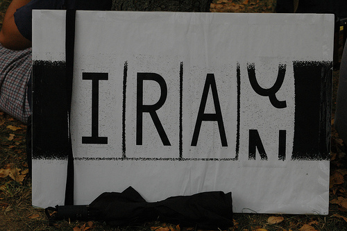
 Steven Heller talks about how themes like war and peace are too big for anyone to make sense of, therefore "surgical propaganda" should be used to effectively target a problem area. I feel like this image, although the theme is large, still communicates the problem very effectively. It is showing how the war keeps on going, it isn't necessarily saying "Stop the War." It is simply making the viewer aware of what is happening in the Middle East. Clever idea, effective, and I believe I have seen this as a bumper sticker, so mass production is available to communicate the message on a greater scale.
- Radio
- Technology
- Television
- Global coverage
- Internet
- New Media
- New York Times
- Immediacy of global experience
- Game shows
- Web pages
- Virtual reality
- Attention span
- Broadcast
- Action
- Reality TV
- Hyperlinked Storytelling
- Interactive
- Real-Time
- Chat rooms
- Talk shows
- Web advertising
- TV advertising
- Selection
- Quantity / Quality
- "The consumer is not a moron, she's your wife."
- Static media
- Time based media
- Merged media

The article was discussing the roles of technology through communication coming from the perspective of entertainment. I feel that this picture is related to the article because it is of an old game show. It represents how many people became obsessed with getting on TV in order to become a star, or get their 15 minutes of fame. Now, we have personal blogs, or social networking site profiles, YouTube accounts, etc. Everyone is a star. This picture also displays how television was utilized for advertising. I'm assuming that this show was sponsored by 'Stopette Finesse' perfume, followed by commercials when the show goes on break. Much like banners or pop up ads on the internet.
 The old-fashioned radio is related to the article because it marked the beginning of technological communication on a more global scale. It also brought about the need for immediacy on news or other subjects to the general public. The radio had a variety of channels to choose from, much like the television and internet URLs. The ability to choose which channel to listen to brought about more user interactivity to entertainment.
 Chat rooms are related to the article because it describes social networking, and the immediate communication between people through the means of a technological medium. People need information here and now, the internet provides exactly that. I feel like chat rooms somewhat ruin the genuine qualities of conversation, as you can not understand expressions or tones through the means of default text. The super fast qualities of the internet, television, and radio seem to have made most people's attention span very short, and somewhat passive.
Guerilla Graphics by, Stephen Heller
- Propaganda
- Patriotism
- Dissent
- Government control
- Graphic design changing the world
- Humanistic
- Themes
- Taking initiative
- Dealing rationally
- Having a commitment to a specific cause
- Design power comes directly from the design medium itself and will have positive effects if used efficiently.
- Surgical Propaganda
- Influencing new legislation
- Guerilla art
- Pro bono work
 This image shows how guerilla art can be push messages onto people quite effectively. There is plenty of artwork set up in galleries or stores, but only a certain demographic of people is really going to see them. I feel that guerilla artwork is more effective because it reaches out any general person to see. These pieces of art are strategically placed so people will find them and learn the message they are trying to communicate. It is a way of pushing positive thoughts and effects on the community.
This image is related to the article because it shows the means of how some guerilla artwork is put up. Sometimes it can be illegal, like spray painting a wall. However, I feel that the only way for guerilla art to work more effectively is through illegal means. This allows the artist to create something that is more out of the ordinary, which catches the eye of the public. This in turn makes them think about what message the artist is trying to communicate. I think the message in this photo is to "break down the wall."
 Steven Heller talks about how themes like war and peace are too big for anyone to make sense of, therefore "surgical propaganda" should be used to effectively target a problem area. I feel like this image, although the theme is large, still communicates the problem very effectively. It is showing how the war keeps on going, it isn't necessarily saying "Stop the War." It is simply making the viewer aware of what is happening in the Middle East. Clever idea, effective, and I believe I have seen this as a bumper sticker, so mass production is available to communicate the message on a greater scale.
Wednesday, February 24, 2010
Bauhaus
Important topics of the lecture:
- De Stijl Journal
- Everyday objects elevated to level of art
- The New Typography
- Gerrit Rietveld
- Russian Suprematist and Dutch de Stijl are most hated of all art movements
- Influence for all arts of 20th century
- Bauhaus - model for most art schools in 20th century
- Bauhaus establishes design as a discipline taught and practiced
- Photoplastics - the essence of art and design was the concept, not execution
- Photoplastics - expanded role of photography in design context
- Typophoto - typography is printed information, photo is the visual representation of what is optically perceptible.
- Bayer developed a widely imitated recipe for a modernist page
- Jan Tschichold brings 20th century typographic expression to full realization then looks back rejecting many of it's dictums.
- Functional design by the most straight forward means.
- White space given a new role as interval and structural element.
- Tschichold declared families of sans serif fonts modernist type.
- Tschichold turns away from new typography.
Wednesday, February 17, 2010
Unit 2 Lecture 2
Important topics of the lecture:
- Russian Constructivism
- Approaching design as cultural force
- Pure form becomes content
- Suprematism uses only pure form and color.
- Suprematism evolves into constructivism.
- Suprematism was the theoretical model for an abstract visual language.
- Collaboration increased.
- The emergence of the Constructivist movement lasted 5 years between 1917 and 1922
- The role of art in the revolution was to oppose old orders.
- Photography was much more powerful than illustration.
- Influence on film.
- The goals of constructivism were the unification of Communist ideology with a visual form. As well as forming a new world of objects for a new social order.
- Style was indigenous to revolutionary Russia.
- Rodchenko
- Architectonic
- Photomontage innovations
- Constructivists enhanced rhetorical power through hyperbole.
- Rodchenko turned his energy into commercial art.
- El Lissitzky remained idealistic to goals of Suprematism.
- Art meant the creation of new 'objects'
- Beat the Whites with the Red Wedge
- Visual forms represent a set of abstract forces to serve the utopian cause.
- Cinematic power
- Pictorial spreads
- The 'Isms' of Art book
- The Steinberg Brothers
Subscribe to:
Comments (Atom)